 Over the past 20 years, the Energy sector has moved from being one of the best parts of the S&P 500 to one of the worst.
From January 2000 through December 2010, the S&P 500 Energy sector had an annualized return of 10.44%, a standard deviation of 20.60%, and a coefficient of variation of 1.97. Those returns are more risk-adjusted and better than Consumer Staples, Technology, Health Care, and style box investing over the same time period. When looking at efficient frontier analysis from 2000 to 2010, to be on the efficient frontier using those five sectors every portfolio needed some allocation to Energy with 100% Energy being the highest-returning portfolio on the frontier.
However, from January 2011 through September 2020, the S&P 500 Energy sector had an annualized return of -5.15%, a standard deviation of 24.81%, and a coefficient of variation of -4.82. Those returns are much riskier and worse than Consumer Staples, Technology, Health Care, and style box investing over the same time period. When looking at efficient frontier analysis from 2010 to 2020, to be on the efficient frontier using those five investments required not having an allocation to Energy at all.
Over the longest time period of data for these sectors on Morningstar, from October 1989 through September 2020, the S&P 500 Energy sector had an annualized return of 6.28%, a standard deviation of 20.60%, and a coefficient of variation of 3.28. Furthermore, Energy appears on the efficient frontier only in a 10% allocation as a part of the lowest risk-return portfolios.
So this all begs the question:
What happened to Energy?
The most basic forces of economics are supply and demand. Unfortunately for Energy investors, energy has had both a supply and a demand problem in recent years.
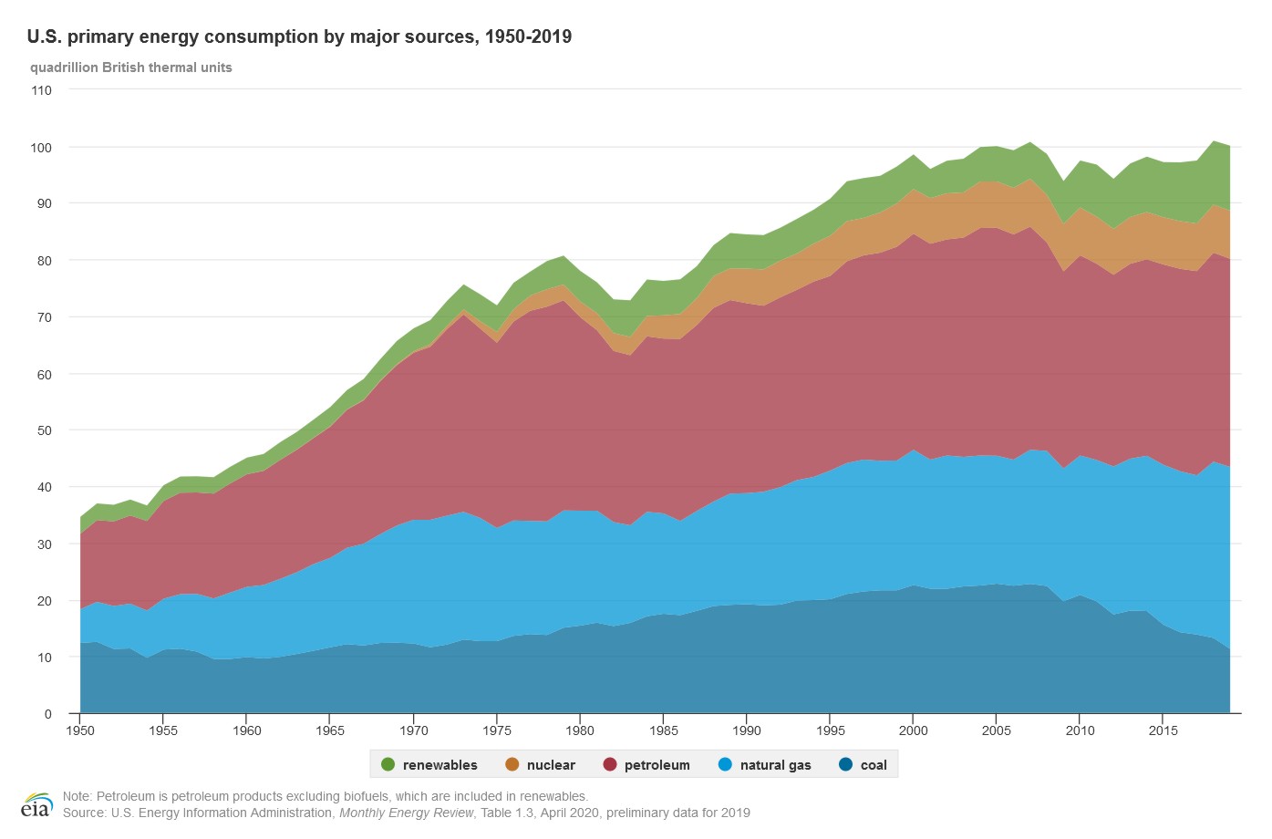
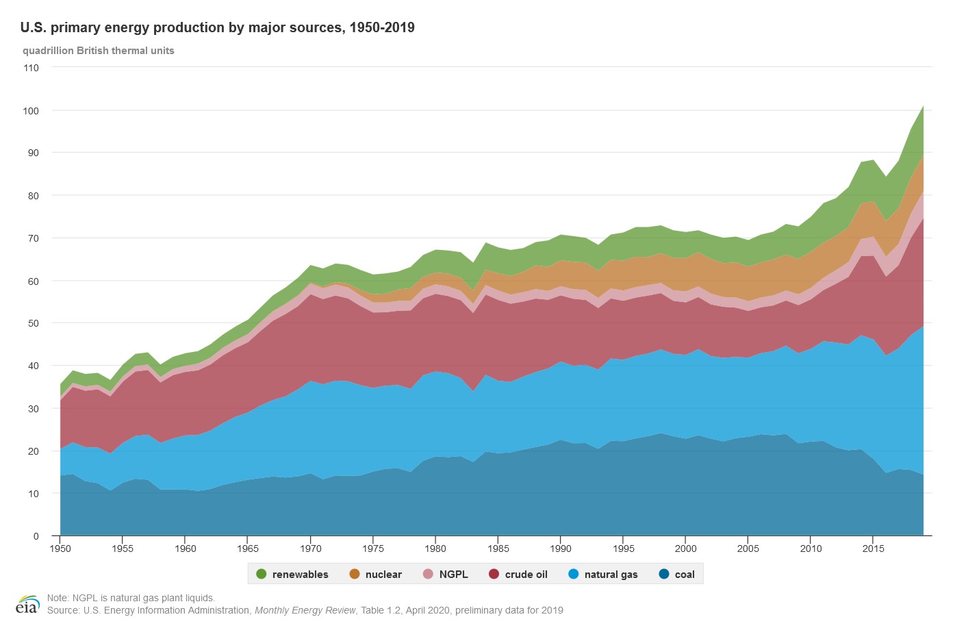
You can see this effect when looking at these two graphs with the same axis units from the U.S. Energy Administration showing the U.S. energy consumption and production from 1950 to 2019.
Consumption / Demand
As you can see from this chart, overall energy consumption has been increasing sharply over most of the time period. However, around the year 2000, energy consumption leveled off and even saw decreases.
There are many explanations for this. Much of the world is striving to be more energy efficient, both for cost and for the environment. Technology is improving and now requires less power to function. Battery storage efficiency is improving. Cars are more energy efficient. The Internet and telecommuting helps to cut down on daily travel.
All these factors and potentially more have played a role in curbing increasing demand for energy.
Production / Supply
As you can see on this chart, overall energy production has been relatively level for the decades between 1970 and 2009. Then in 2009, production started climbing rapidly.
There are many explanations for this. A push to find new energy sources brought more options to the market. New natural gas pipelines have expanded our ability to use this energy source. The expansion of nuclear energy has added to our overall supply. We have discovered more oil fields and extensive use of fracking has brought previously unobtainable oil and natural gas to the market.
All these factors and potentially more have played a role in increasing our energy supply.
The Effect
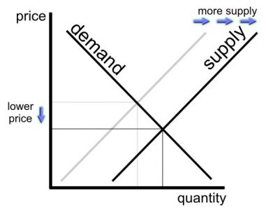
Energy production (supply) has seen a sharp increase within the last ten years while energy consumption (demand) has either remained the same or drifted downward over the same time period. An increase in supply without a change in demand means that the price of the product goes down.
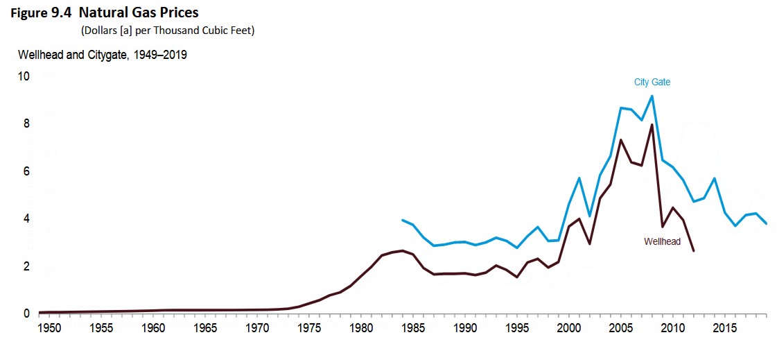
You can see these lower prices play out in the monthly price data from the U.S. Energy Administration:
You can see in both the graphs for petroleum and natural gas, there is a sharp dip in price right around the 2009 spike in energy production.
With the price of the product lower, the expected earnings of the company will drift lower. Lower expected earnings means lower profitability, and lower profitability means the company is likely worth less as an investment.
However, supply and demand change over time as both consumers and producers react to the new situation. Nothing in the economy can ever be graphed as a straight line. The Energy sector could be one discovery or blunder away from greater or worse earnings. It could be adjusting to a new normal. It could be poised for a recovery or dangling above a dip. Past performance has little if anything to do with future returns.
Our Energy Overweight
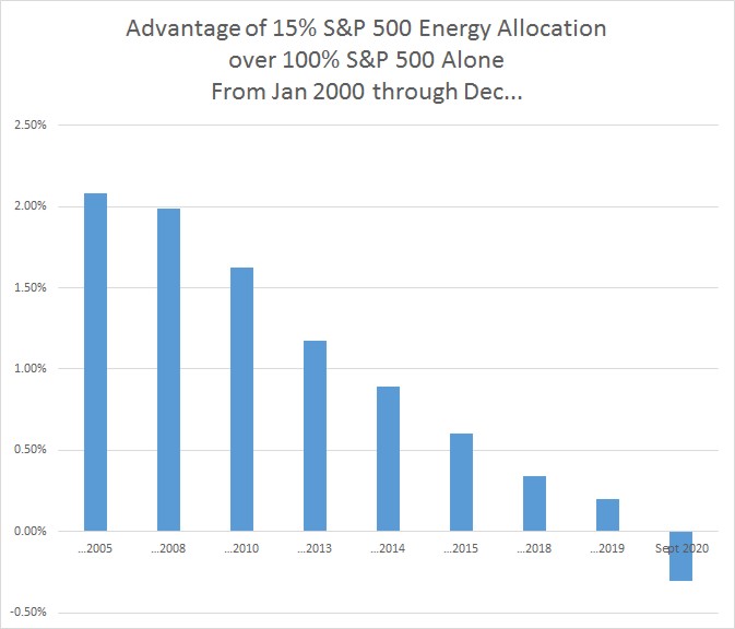
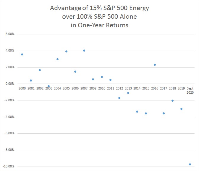
The S&P 500 has an allocation to Energy that is simply based on the size of the energy companies which meet the criteria for the index. Assuming that this cap-weighted allocation to Energy is the normal weight, we have always had an Energy overweight in our allocations by adding on Hard Asset, Resource Stock, or Energy funds. Since 2000, historical data has showed that this overweight did grant an advantage.
However, when you look at returns year by year, you can see that Energy’s strong historical returns play a large role in its advantage. While in more recent years (2012 onward), an extra allocation to energy has largely hurt returns.
From January 2000 through December 2007, the S&P 500 Energy sector enjoyed the large annualized return of 16.26% with only a standard deviation of 18.37% for the surprisingly low coefficient of variation of 1.13. This can be compared with the current stock market darling of Technology, which over the same time period saw an annualized return of -7.69% and standard deviation of 30.83% for a coefficient of variation of -4.01 as a part of the The Dot Com Bubble: The Bear Market of 2001.
In 2007, David Marotta wrote in “Using S&P 500 Index Funds Contains Hidden Risks“:
Energy stocks, which represent about 20% of the earnings in the S&P 500, only comprise 7% of the investment. This style of investing undervalues the energy sector at a time when hard asset stocks (oil, land, lumber, precious metals) have been doing particularly well.
Those who only invested in the S&P 500 as a whole did not capture as much in gains. From January 2000 through December 2007, the S&P 500 as a whole only saw a 1.66% annualized return with a standard deviation of 13.79%. Meanwhile, an asset allocation that had a 15% Energy overweight, was able to increase returns to 3.91% (+2.25%) and decrease standard deviation down to 13.33% (-0.46%).
Over this early time period, a portfolio of 100% Energy was the highest-returning efficient portfolio most years. In fact, it is not until you include returns through the end of August 2014 that a portfolio of 100% Energy loses its place as the highest-returning efficient portfolio when considering portfolios of Energy, Consumer Staples, Technology, Health Care, and style box investing. From January 31, 2000 to September 30, 2014, the highest-returning efficient portfolio from this blend was 90% Energy and 10% style box investing.
To be clear, neither 100% nor even 50% Energy are well-constructed portfolios. As I’ve said before in “How to Use An Efficient Frontier Graph,” if we follow the historical data without any artistry, we would find ourselves with strange and concentrated allocations. Instead, you need to couple efficient frontier analysis and historical data with artistry. However, the historical returns help us to tell the narrative of the Energy sector.
During 2015, Energy’s poor returns continued. From January 2000 through June 2015, the S&P 500 Energy sector had seen an annualized return of -0.15% and standard deviation of 25.98%. Despite these dismal long-term returns, over the same time period the highest-returning efficient portfolio is 30% Energy and 70% style box investing which overall had an annualized return 9.31%, standard deviation of 15.65%, and coefficient of variation of 1.68.
This shows how a well diversified portfolio can be better than the sum of its parts over long time periods. As Energy booms in the early time periods, rebalancing has you selling off those spectacular gains so you can buy more of the busting Dot Com Bubble. Rebalancing to that 30-70 allocation then positions you well for the next decade when Energy does poorly and the other sectors do well. This is how the rebalancing bonus works and is one reason that short-term poor returns are insufficient to abandon a data-justified investment strategy.
After June 2015, Energy’s role on the efficient frontier diminishes. In hindsight, removing our overweight to energy around 2015, 2016, or 2017 would have been a wise decision. Even at the time, we were actively talking and debating about the role of Energy in our portfolios. Our 2016 article “The Case for Investing in Energy Companies” presents much of the data we were working with at the time.
With only a few years of data suggesting that energy may no longer be part of efficient portfolios, its short-term volatility continued to be a confusing signal. In our 2017 article “Resource Stock Investing in 2016,” we wrote about how Energy had some of the best returns for the prior year. While in many other years, energy dragged along at the bottom.
There is no way to tell what the future holds. News reporting on Energy has always been fraught with a boom-or-bust mentality. In the past twenty years, the news has reported on both energy scarcity and abundance as well as both price controls and subsidies. Assuming that what is currently happening will continue to happen (drawing a straight line projection) will make your predictions meaningless.
We don’t want to fall prey to this mistake. As we explain in “How Long Should I Give An Investment Plan?,” the crucial question to making a change in your strategy is “Do you have sufficient data to justify the long term mean returns you want?”
As we look at Energy, we believe that overweight to the sector used to be helpful but is no longer serving us well.
Why We Removed Our Overweight
In April 2020, we wrote about how Energy stocks have had disappointing returns since 2015. Then as the 2020 COVID-19 pandemic brought the United States into a social distancing quarantine, the expected earnings of the Energy sector went negative and our dynamic tilt tilted us very far away from Energy in May 2020.
Since 2015, we’ve frequently returned to the topic of Energy in our Investment Committee conversations. With the pandemic crippling the sector, we decided the time was right to do another deep dive into Energy to see what if any institutional, governmental, societal, or corporate changes have altered this category enough to suggest that it is no longer a good investment.
This research brought us to several conclusions.
First, even though Energy was a great portfolio addition historically, Energy has fallen off of the efficient frontier in recent times. With our recent frontier analysis, we feel we have more data to justify a Consumer Staples, Technology, and Healthcare overweight than we do an Energy one.
Second, we had hoped that Energy would serve as a hedge against inflation. The logic went like this: The expenses of resource stocks are paid up front with the purchase of the extraction, timber, or mineral rights or with the purchase of real estate properties. That ownership lasts for a long period of time, so theoretically inflation cannot meaningfully impact their expenses. Meanwhile their profits in the form of sale prices or rents can increase with inflation. This means that it has been assumed that resource stocks can provide a portfolio with protection against high inflation.
This belief is repeated by many investment journals; however, when we tested this hypothesis, we were surprised at how mild the effects are for Energy. While Energy did see higher returns during periods of high inflation such as 1969 through 1982, you can see from the supply and demand graphs above that higher returns over this time period are also easily explained by the increased demand.
Third, the more we invest in Energy, the less we have to invest in other sectors. Because of how our asset classes are designed, having more allocated to Energy means having less invested in U.S. and foreign REITs. However, both U.S. and foreign REITs consistently make it on the efficient frontier in allocations of 10% or more, even in recent times and including troublesome downturns like the 2008 housing crash.
Fourth, the increases in supply seem to be a technological advancement in the field of Energy which is going to stay. There are oil wells and natural gas which are offline and just waiting to be harvested. This pent up supply means that if the price ever does rise, producers will be motivated to increase supply again and once again lower the price.
For this reason, we suspect that the price of energy will continue at its lower rates for the near future. This means that the returns of 2010 onward may be more accurate to the new Energy economy than the returns prior to 2010.
No one knows what is going to happen. Energy might see new advancements tomorrow which will boom the sector back into the winner’s circle. However, we don’t feel we have sufficient data to justify those beliefs.
Fifth, Energy has a bad rapport. Among those inclined towards Socially Responsible Investing, divesting from Energy in favor of either clean energy or just other sectors is one of the most popular requests. Even though Big Energy companies like Exxon Mobil are also some of the biggest researchers for alternative energy, these companies still have a bad reputation because of their relationship to pollution, climate change, and environmental destruction.
Most investors don’t want an overweight to Energy for these reasons, making the bar Energy has to jump in order for us to recommend including it that much higher.
Sixth, the recovery of Energy is as uncertain as the pandemic. Energy was hurt by the pandemic and demand is down. The hopes of ending the quarantine are riding on the development of a vaccine which could take one to two years or more before we actually see the effects. Because of this long timeline, the most basic narrative would suggest that Energy may merely limp along waiting for a new normal to come back. Also, as people become used to telecommuting, remote learning, home gyms, less travel, and more life changes, it is unclear if Energy will see a full recovery even when the pandemic is done.
What We Did
Because of these findings, we decided to reduce our Resource Stock allocations in August 2020 to a flat 10% of our stock allocation. Previously, we had a complex formula which tied the amount of Resource Stocks to the amount of bonds in a portfolio.
At the same time, we also decided to begin to gradually phase our Energy allocations (the overweight) out of our Resource Stock category in increments of 10% of our Resource Stock allocation. In September 2020, we reduced the allocation by another 10%. However, this October 2020, we decided to eliminate our Energy overweight.
It is important to note that we still have Energy exposure in our portfolios. Both our U.S. and foreign investments have energy allocations.
Before removing our Energy sector allocation, the Energy exposure of a 100% Stock portfolio was close to 5-6% of the portfolio. After this change, Energy represents closer to 2-3% of the portfolio.
Energy may regain some ground. However, both the pandemic and the oversupply of Energy have hurt its current profitability, and we believe that the demand for and innovation of the clean energy is here to stay. We also believe that holding on to Energy and waiting for it to recover might mean missing out on greater gains elsewhere.
For this reason, we are removing our overweight to Energy and reallocating our energies elsewhere.
Photo by Carlos Quintero on Unsplash
