The World Health Organization 2000 Statistical Report, in addition to having many methodological problems, does not even remotely survey what the average person would intuitively think of as healthcare performance. The resulting ranking of countries that it produces is a nonsensical list of how well each country lives up to the World Health Organization’s far-fetched and sometimes arbitrary measurements only loosely based upon theoretical factors.
Their reports most often take the format of strongly stated descriptions of their opinion followed by bad mathematics and nonstandard methods. Their study is not valid, reliable, or repeatable. It should be ignored.
Throughout this post I point out 29 red flags, which are errors in or deviations from common statistical reporting, mathematics, or the scientific method. I see these errors as being fundamental problems with the study, any one of which being sufficient to discount their findings.
A Brief History
On June 21, 2000, The World Health Organization (WHO) published, what it’s press kit called, “the first ever analysis of the world’s health systems.” It was a complex analysis of 191 countries across 5 underlying factors with further underlying sub-factors of each one.
Most of the time the media reported the study simply saying, “The United States is ranked 37th when it comes to healthcare, not first. Aren’t you shocked?!” This is even what the WHO press release says. One of the first things they write is, “The U.S. health system spends a higher portion of its gross domestic product than any other country but ranks 37 out of 191 countries according to its performance, the report finds.”
If you look at Annex Table 1, the summary table of the report, there is a column on the far right titled “Overall Health System Performance.” This column reveals the rank of each country. On this table, you can clearly see that the United States has “37” typed in that column. The question is, how did the World Health Organization (WHO) determine that the United States deserved a “37” rather than any other integer between 1 and 191?
After I have studied their technical reports and data for over a month and a half, I have finally been able to track their formulas and findings across the many sub-studies and their corresponding literature to both attempt to recreate a vast majority of the data in my own Excel spreadsheets and determine why the United States has been ranked 37th. The methods and statistical formulas used are at times surprising, alarming, or comical.
The results clearly shock many, even now when the study is over a decade old.
After the article’s release in June 2000, the articles about it continue to roll in. A brief timeline is:
Even recently, we’ve seen: October 15, 2013 – Tulsa World reported, “The World Health Organization ranks the United States 37th of 191 countries for the performance of our health system — which is disturbing because we have one of the most expensive health care systems.” August 31, 2013 – Pennsylvania’s Morning Call reported, “For about double what [the French and Canadians] pay per person, Americans get a health system that ranks 37th out of 191 countries.” October 16, 2013 – Care2 wrote, “Not all health care is created equally, however. On the global front, the WHO ranked the U.S. 37th overall for its healthcare system.” November 2, 2013 – News-Times writing “The World Health Organization ranked the United States 37th out of 191 countries in healthcare efficiency”
So the WHO Statistical Report has gotten a lot of press citation, but few if any articles deal with evaluating the actual methods or procedures of this so-called scientific study. And yet, it has been used to claim the need for healthcare reform and specifically the need for the Affordable Care Act in the United States.
Overview
The study was conducted almost exclusively in the year 2000 with a series of micro-studies being pulled together for the final meta-report, which was released in June 2000 under the name “The world health report 2000 – Health systems: improving performance.” The study claimed to have ranked the WHO 191 member states in order from best to worst in terms of “overall health care” using “five performance indicators.” In addition to the final report, a statistical annex was also released which lists all of their PDF data tables in less rounded Excel spreadsheets.
It is easier to conceptualize the study, if you think about there being 5 stages to its completion.
Relating To Expenditure: That composite variable was related to overall healthcare expenditure to produce “overall performance.” Those final scores of overall performance were sorted and a corresponding rank given to each country.
The five performance indicators, or underlying factors, and ultimately their decided weights were:
[25%] Health Level, also called Disability-Adjusted Life Expectancy or DALE
[25%] Health Distribution, also called Health Equality or equality of child survival
[25%] Fairness in Financial Contribution
[12.5%] Responsiveness Level
[12.5%] Responsiveness Distribution, also called Responsiveness Equality
So the final formula used to calculate overall health system attainment (the factor of stage 5, although there is another unpublished final formula used in stage 6) was:
Although it is very difficult to find out why WHO chose the factors it did for evaluating health systems performance, ultimately the answer is found in a paper titled “A WHO Framework for Health System Performance Assessment.” This work was explicitly for the purpose of creating the factors for the 2000 WHO Statistical Report.
The paper is notably not a survey, study, or research project. It is a theoretical paper. This should be our first red flag. The authors, Christopher JL Murray and Julio Frenk, are philosophizing in order to answer the question “what are health systems for?” (pg.3).
Although many psychological or sociological tests begin with only theory, there are two steps to making a new indicator test: theory and findings. One example is the Myers-Briggs Type Indicator. Although their initial questionnaire was based upon the theories of Carl Jung, their final product was based upon findings. In other words, Jung proposed each of the personality traits based on his philosophical theory, but it was correlation studies and behavior examination which produced both the indicator test and the personality descriptions respectively.
This WHO paper is not founded upon findings at all though nor do they have a separate paper where they test the theories of these two men against findings. It is only the musings of theorists and should be taken as such. You or I could just as easily write a contradicting paper where we philosophize and theorize a completely different set of five, two, or ten different factors which should really comprise health system performance.
Arguably though, one of set of factors will be a more accurate test. Just like, in the field of personality psychology, the Myers-Briggs Type Indicator has been largely replaced by the Big Five personality traits because of the Big Five’s superior ability to correlate to relevant real world measurements. However, we could not determine which set of factors was superior until we conducted a study.
Because Murray and Frenk are not using any findings to support their theory, we can proceed to evaluate all of their claims the way we would a philosophy paper, trying to find counter examples which show their theory doesn’t accurately model or account for reality.
After a few pages discussing the complexity of their task, the philosophers begin their development of a framework. They write (pg.5, emphasis added):
Organized activity of society can be divided into various systems such as health, education, production of consumer goods, politics, culture, security etc. For each of these systems there is a defining goal, the reason for which the system exists. For the education system, this goal is to educate individuals and for the health system it is to improve health (both the average level and its distribution across individuals). In addition to the defining goal for each system of society, there are two goals common to all systems. These are responsiveness of the system to the legitimate expectations of the population and fairness in the financing of the system.
In other words, Murray and Frenk believe that there are three goals which underlie every system: to improve the level and distribution of the good you’re trying to achieve, to respond to expectations, and to have fair financing. Because this is a philosophy paper, the way to disprove their belief is to provide a counter example. In this case, a counter example would take the form of some system which exists for a purpose other than all three of those goals.
The goal of fair financing is later defined to be addressing two challenges: “First, households should not become impoverished or pay an excessive share of their income” and “Second, poor households should pay less… than rich households” (pg.8).
An example of a system which does not try to address this goal is the current U.S. economic system. In the free market system (our current system), prices are set without the income of individuals in mind. Furthermore, the economic system does not even have the goal of setting prices as a “share of individual income.” Such a goal lurks in the back of no businessman’s mind. The same is true for the second challenge. Our free market system does not pay attention to a household’s net worth when setting prices. The rich pay what the poor pay. If eggs are $3, then the rich and the poor alike pay three dollars.
This counterexample disproves their claim that fairness in financing the system is the common goal of all systems, for it is not a goal of the free market system.
They anticipated this critique though and go on to say:
…for every system we have a goal of fairness in financing. What is considered to be fairness in financing may vary considerably for different systems. Perhaps the market mechanism for financing, where what you pay for is what you get, is appropriate for most consumption goods, but for health, education, security and some other systems, the concept of fairness in financing may be very different.
However, this definition of fairness in financial contribution makes the phrase nearly meaningless. If both the rich and poor paying the same percentage (in the healthcare system) and paying different percentages (in the economic system) are “fair,” then their definition of “fairness of financial contribution” is too broad. They have devolved the phrase of meaning. It is unreasonable for them to hold the definition firmly as a Marxist one for financial fairness in everything but the economic system. This sort of inconsistency undermines their argument.
Furthermore, I would argue that the financial goal of the free market system is allocation of goods not “fairness in financing.” The free market system is one that works just as well if what are used as payment are intangibles, like a sentiment or a service, or tangibles, like currency or a physical good. There doesn’t need to be a sense of “fair” for the free market system to thrive. What is mine that is spent to buy what is yours need not actually be of equivalent value; it need not be fair.
For example, the free market system commends gifts just as much as purchases. In a gift, you don’t pay anything and yet receive a lot. We do not consider such a trade to be “fair.” We consider it generous. Generosity looked at from the other perspective is just an unfair trade.
Another counter example to their claim that these three factors are the goals of every social system is the sporting system. Regardless of which sport we are looking at, the system of sports has very different goals than the WHO study suggests it should have as a societal and social system.
First, the sporting system does not care about distribution or level of the good it gives out. For example, people watch sports unequally. Some do not watch any sports, many do not watch wrestling, and many more do not watch curling. Wrestling and curling are not failing to meet the goal of equal, universal, or even widespread distribution; they simply are not trying to achieve it. As a niche sport, for example, curling is satisfied to distribute simply to its fans and perhaps even unequally to them.
Second, sports are not necessarily trying to respond to even the legitimate expectations of its fans. For example, half of the fun of watching almost any refereed sport is complaining about the inadequacy of the referee and how much he or she failed to meet your expectations.
Furthermore, the rules are unyielding to your expectations. Many believe that soccer should be higher scoring, but the rules of the game do not accommodate such expectations. The rules are rigid just as the authority of the referee is rigid. Sports are unresponsive to expectations because they do not try to be. It is not their goal.
Third, there is no such goal of fairness of financial contribution in sports. Sports can be accomplished whether they are financed via the market system, the insurance system, the Marxist system, or an anarchist system. Be it a pick-up soccer game or an Olympic figure skating competition, how it was financed does not matter to achieving the goal of the sport.
Furthermore, the financing of sports cannot be called “fair” either, for the payment of players is arbitrary. Payment is not correlated to any logical standard. Players may be paid because of their fame, beauty, talent, performance, or name. They may be paid unequally when considering players of comparable levels or may not be paid at all.
Thus, the sporting system is another counter example. It does not have the goals of distribution, responsiveness, or fairness of financial contribution. It has entirely different goals which do not fit into the WHO’s simplistic look at societal and social systems.
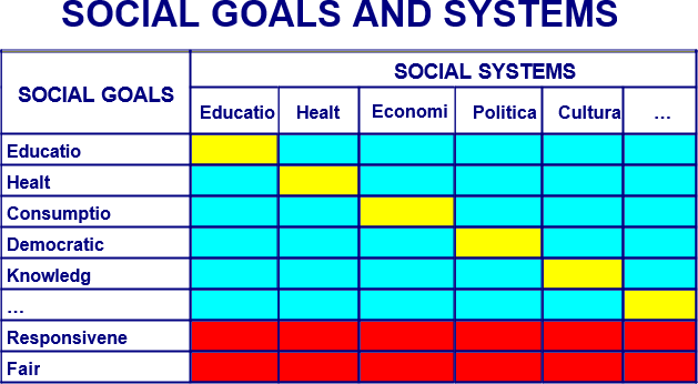
The philosophers go on to create an unnecessary Figure to demonstrate their viewpoint:
Figure 1
The health, education or security systems may and most likely do affect (positively or negatively) the attainment of the defining goals of other systems. Recognizing these interactions, we can define a series of cross-system goals for each system. The resulting relationships are captured in Figure 1. Columns represent different systems of social activity and the rows represent various social goals and the two common goals of responsiveness and fairness in financing. The diagonal cells are the defining goals for each system. The two bottom rows represent the goals of responsiveness and fair financing common to all systems. The remaining cells represent the cross-system goals. For health there are the goals of improving health, responsiveness and fairness in financing and also the goals of contributing to other major social goals such as consumption, education, democratic participation etc. The matrix of systems and goals emphasizes the interdependence of all parts of society and the multiple social goals to which all systems may contribute, but at the same time recognizes the primacy of the defining goal and the common goals of responsiveness and fairness of financing.
And then they say, “Based on the matrix shown in Figure 1, we can more explicitly formulate the three main goals for the health system: health, responsiveness and fairness in financing. These three intrinsic goals should be routinely monitored by all countries and form the main basis for the assessment of health system performance facilitated by WHO” (pg.6).
Note the “should.” These philosophers have shifted from theorizing to making normative claims. They claim these three goals they just invented not only are a methodology of indicating which countries have the best healthcare but that every country should care about these factors. That type of normative claim even the creators of the Big Five personality traits haven’t made, and they have demonstrated that their indicator correlates to financial, social, occupational, and educational success.
Frenk and Murray’s definitions for the three factors are as follows:
Health: “We are concerned both with the average level of population health and with the distribution of health within the population, namely health inequalities.”
Responsiveness: “The second intrinsic goal is to enhance the responsiveness of the health system to the legitimate expectations of the population for the non-health improving dimensions of their interaction with the health system. …We propose that responsiveness has two key sub-components: respect of persons and client orientation. Respect of persons: the elements of dignity, autonomy and confidentiality, capture aspects of the interaction of individuals with the health system that often have an important ethical dimension. Client orientation, includes the latter four elements, that are major components of consumer satisfaction that are not a function of health improvement.”
Fair financing and financial risk protection: “Contribution to the health system should reflect this difference in disposable income between rich and poor. In practice, we believe that every household should pay a fair share towards the costs of the health system. (In the case of very poor households, “fair share” might comprise no payment at all.) As a normative proposition, we argue that payment should be based on income and should mostly not reflect use of services or risk.”
These definitions are pure opinion, although the philosophers writing them are and admit to be making normative claims. They believe healthcare systems should try to achieve these goals. It is debatable whether they think that healthcare systems are trying to meet these goals.
In any case, these two people’s opinion are the foundation of the WHO’s overall performance factors.
Red Flag Summary
The factors of the WHO study are based on the opinions of only two people. The justification for these factors is a theoretical paper. It does not use facts, correlation, or studies to try to validate the opinions of its philosopher authors.
The definitions of the underlying goals are defined inconsistently and ultimately devoid of meaning. Then, when they apply the phrases to healthcare, they retract to very rigid definitions without explanation.
STAGE TWO
Calculating Health Level
Health level, ultimately weighted 25%, is just the country’s “Disability-Adjusted Life Expectancy” (DALE). DALE is a favorite WHO statistic and supposed to reflect “the number of years that an individual born today would expect to live in full health” (pg.4). The phrase “in full health” is the important part. The idea is this number reflects if every child was born without disabilities how long would they live on average. Sometimes it is just called “healthy life expectancy.”
The Explanatory Notes say the explanation for this calculation can be found in another report, “Estimates of DALE for 191 countries methods and results,” also not available on the same page as the WHO Statistical Report. This report explains that health expectancy (health level) is the “time lived in full health” plus the “time lived at each age in a health state less than full health” weighted “by the severity of the health states” (pg.4). Meaning, the more severe the “health state” the less that factor impacts the result of the formula.
However, no where in Estimation Report do they thoroughly define these health states or explain by how much they are weighed. They don’t even directly cite another report. Instead they casually say, “The literature on both description and valuation of health states is vast and rapidly expanding,” and cite four of their footnotes, none of which says what weights or definitions were used for health states (pg.12). Hiding these important pieces of information compromises the repeatability and thus credibility of their study. We as readers are forced to simply trust their numbers even though such measurements may not be standard or reliable.
The 2000-published report even claims that “one of the main objectives for the ongoing WHO” is to achieve a global “standardized description of health states… and valid measurements of valuations of time spent in health states,” implying that at this point, a standard, valid measurement has not been achieved (pg.15).
They go on even to do more than just imply. They have an entire chart entitled “Table 2. Health domains included in 12 generic health status measurement instruments.” which shows 12 different DALE measurements developed between 1970 and 1999 which are, in their words, only a summary of the “the more widely used instruments.” In fact, they go on to say that there exist “a wide range of instruments… in various languages to use individual responses to measure various dimensions or domains of health states,” adding even more variability to what sounds like already a crude measurement (pg.13).
They admit this downfall later, writing, “A fundamental problem with current self-reported instruments is a lack of cross-cultural comparability,” and yet that is precisely what the 2000 WHO Statistical Report is trying to do (pg.14).
This is all a critique of their measurement however, but the concept itself suffers problems as well. If you remember back to the paper where they defined the framework, they claimed that this goal “for the health system… is to improve health (both the average level and its distribution across individuals)” (pg.5). However, DALE does not measure the “improvement of average health level,” but rather the current state of life expectancy.
Life expectancy, almost by definition, is something which cannot be improved only diminished. Dictionary.com defines “life expectancy” as “the probable number of years remaining in the life of an individual or class of persons determined statistically, affected by such factors as heredity, physical condition, nutrition, and occupation.” Heredity and occupation are each things the health system is not trying to change. Nutrition is not something which the health system can easily influence. It is only physical condition which the health system can potentially alter and even then, they can only slow or prevent a present discovered decline not extend a person’s life expectancy. Some people’s genes are just not as resilient as other people’s.
That’s why there are huge scientific studies being conducted right now on the genetic code of centenarians, those who are living to and beyond 100 years old. There are even more studies looking at the influence of diet and exercise on life expectancy. Both genetic codes and healthy lifestyle decisions are not the scope of the healthcare system. Healthcare, also as defined by Dictionary.com, is “the field concerned with the maintenance or restoration of the health of the body or mind.” Both maintenance and restoration are not extension of life expectancy.
A healthy longevity has more to do with the population being measured than it does with the healthcare available. Differences in the quality of healthcare provided are not the primary contributor to this measurement.
So even though their methods are not clear, this report releases their findings: Japan ranks 1st in health level with a DALE of 74.5 years and the United States ranks 24th with a DALE of 70.0 years.
Japan’s first rank is not surprising. One of the largest percentages of centenarians is located on the island of Okinawa and Japan’s incidence of centenarians is over twice that of the United States. In addition to a trendy diet (Okinawa Diet), there are several longevity studies being conducted on the island’s populace.
Red Flag Summary
The precise formula to calculate DALE as well as the numbers they used to calculate each country’s DALE is not made available. Hiding these important pieces of information compromises the repeatability and thus credibility of their study. We as readers are forced to simply trust their numbers even though such measurements may not be standard or reliable.
The report suggests that a standard, valid measurement for DALE has not yet been achieved, discrediting the results of this entire category.
They even admit, “A fundamental problem with current self-reported instruments is a lack of cross-cultural comparability.”
DALE does not measure the “improvement of average health level” as this factor is supposed to measure but rather the current state of life expectancy, a health trait not easily influenced by any healthcare system.
Calculating Health Distribution
Health inequality (later called health distribution) is the next factor and is ultimately weighted 25%. The DALE report says, “In the World Health Report 2000, health inequality is assessed for member countries in terms of child mortality inequality” (pg.11). The Explanatory Notes calls it “the index of equality of child survival.”
According to the Explanatory Notes, their statistics were an attempt to “distinguish between variation across mothers in the number of children who have died due to chance and that due to differences in the underlying risks of death” (pg.3). The WHO Statistical Report used “expected survival time under age 5 years” to calculate this. In other words, a bad score for health inequality suggests that some mothers have a greater risk of losing their child then other mothers. A good score suggests that all mothers have the same risk of losing their child.
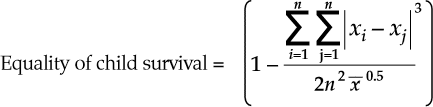
If every child dies in childbirth, you get a perfect score. This certainly is not the intention of improving health “distribution across individuals” as the philosophers suggested the factor meant (pg.5). Don’t believe that’s what the formula says? Let’s use their formula (pg.4):
Their formula is one minus the sum of the cubed absolute value of the difference of each mother’s offspring’s survival time for the first five years divided by two times the number of children squared times the square root of the mean survival time across children. It is important to note here there is no explanation why the difference is cubed (normally this is to amplify the statistical significance of differences), the mean is square rooted (normally this is to diminish the influence of if the number is large, which in this case is if the child survival is a good outcome), or why there is a two in the denominator. These decisions seem to be made to increase the influence of differences while decreasing the importance of good outcomes, which is exactly opposite of their factor’s stated goal.
That being said, let’s compare two populations. One has 4 children who all died at age 1; the other has 5 children who died at 1, 4, and three who survived past age 5.
The first population of four dead children calculates like this: the numerator, for every child, is one minus one, which is zero. The absolute value is zero and the cubed result is zero. Zero divided by anything is zero and then 1 minus zero is 1, a perfect score. The population of four dead children has achieved perfect equality as far as health distribution is concerned.
The second population of three living children calculates like this:
The numerator:
Child i
Child j
| i – j |
Cubed
Running Sum
1
5
4
64
64
1
5
4
64
128
1
5
4
64
192
1
4
3
27
219
4
5
1
1
220
4
5
1
1
221
4
5
1
1
222
4
1
3
27
249
5
5
0
0
249
5
5
0
0
249
5
4
1
1
250
5
1
4
64
314
5
5
0
0
314
5
5
0
0
314
5
4
1
1
315
5
1
4
64
379
5
5
0
0
379
5
5
0
0
379
5
4
1
1
380
5
1
4
64
444
Thus, the numerator is 444.
The denominator:
Mean Survival
(Mean Survival)^(0.5)
n
n^2
2*(n^2)*((Mean Survival)^(0.5))
5 + 5 + 5 + 4 + 1 = 20
20 / 5 = 4
(4)^(0.5) = 2
5
25
2 * 25 * 2 = 100
Overall:
1 –
444
=
1 – 4.44
=
-3.44
100
The result is -3.44, a far cry from a perfect score even though this population has better survival times than the population of all dead children.
As the Explanatory Notes say, “As the measure of inequality has a maximum value that can be greater than 1, in theory this transformed measure of equality of child survival could be negative. However, across the range of countries, no country has a degree of inequality that would lead to a measurement of equality less than zero. The value of 1 can be interpreted as complete equality and zero can be interpreted as a degree of inequality that is worse than has been seen in any country measured directly or estimated indirectly to date” (pg.4).
However, in the example above, the population with “a degree of inequality that is worse than has been seen in any country” has an amazingly better survival time than the country with “complete equality.” Clearly, this is a bad measurement for health systems performance, if every child dying before the age of five gets you a perfect score.
In health distribution, Chile ranked 1st with a score of 0.999, suggesting all of their children have the same survival time. The United States ranked 32nd with a score of 0.966, suggesting that 4 out of 5 children have the same survival time and the final child is one year different.
That being said, in Annex Table 2, they list “Basic Indicators for all Member States.” In the list, they report the probability of dying (per 1,000 children) under the age of 5 years. Chile, who ranked first on health inequality, had 11 males and 8 females die per 1000. The United States, who ranked 32nd on health inequality, had 8 males and 8 females die per 1000, so even in their example, the highest scoring country didn’t have the best survival outcome.
Won’t you be comforted when your child dies at the same age as every other child as opposed to the United States where our unequal survival time saves more lives.
Red Flag Summary
Completely bad outcomes suggestive of a bad healthcare system, like every child dying in childbirth, produce a perfect score.
They crafted the formula to calculate health distribution so that good outcomes are under-weighted while equal outcomes are over-weighted. This is completely opposite to what the stated purpose of this factor was.
Calculating Fairness in Financial Contribution
Our next factor, “fairness of financial contribution,” has absolutely nothing to do with the quality of healthcare. Intuitively, I believe most of us agree that the healthcare system’s goal is to promote health in its patients. How the healthcare provider is compensated really isn’t the goal of the healthcare provider. It may be important. The motivation and incentives created by their compensation may influence their ability to further the first goal, but ultimately they are not striving to achieve “fairness in financial contribution,” they are striving to provide healthcare to their patients.
This “goal” was first imagined by Murray and Frenk in their philosophical paper, “A WHO Framework for Health System Performance Assessment.” They defined it as addressing two challenges “First, households should not become impoverished or pay an excessive share of their income” and “Second, poor households should pay less… than rich households” (pg.8).
So, in this preferences study WHO asked themselves and their fans what they thought was the fairest method of paying for everyone’s healthcare. Only 1% answered that everyone should pay the same amount (the insurance method). And only 6% answered that everyone should pay for the healthcare they receive (the market method). The most common answer was that everyone should pay a percentage of their discretionary income after deducting non-discretionary purchases (67% of respondents).
To summarize, we make the normative claim that: A health system is fairly financed if the ratio of total health system contribution of each household through all payment mechanisms to that households capacity to pay (effective non-subsistence income) is identical for all households, independent of the households health status or use of the health system. This is a plausible normative claim that may appeal to many. Nevertheless, we recognize that there may be a long and lively debate as to the ideal conception of fairness of financing for the health system.
…In practice, those who prefer want a health financing system that is even more progressive than that implied by this measure should not be concerned, as no country we have studied comes even close to equal shares of non-subsistence permanent income. We expect and hope that this approach to examining the fairness of health system financing through shares of household non-subsistence effective income will spark debate. But we believe it captures the three key issues: a special concern of for those households facing catastrophic spending for health, for unequal contributions for equivalent households and for the overall progressivity of the system.
In other words, they acknowledge that not everyone will agree with their claim and, with that, not every health system will necessarily believe that this is their goal. This is a huge flaw in this factor. Not only does it not intuitively measure anything having to do with the quality of the healthcare system, but they choose a controversial definition based upon their own related party’s average opinion and claimed it was normative (what you should think). Not only is this pretentious, it is bad science.
Just pages earlier in the same paper, they admitted that there were multiple “types of financing for health” like government-raised, social insurance, private insurance, or out-of-pocket (pg.4), but then they don’t admit in their methods that there are different valid methods of distribution of finances. Instead, they only acknowledge a specific interpretation of the Marxist method, an assumption they build into their formula.
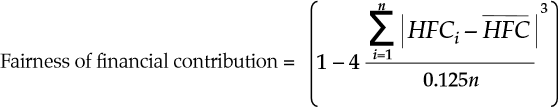
The 0.125 in the denominator is equivalent to 1/8. Because it’s multiplied to the entire denominator, it’s equivalent to multiplying the numerator by 8. The numerator though is already multiplied by 4 though, so an equivalent formula would be 1 – 32 * (sum/n). It’s unclear why the 32 is included. It seems arbitrary.
The rest of the formula is calculating the difference between each household’s “Health Financing Contribution” or their percentage of “non-subsistence spending” used on healthcare and the mean Health Financing Contribution of that country. Then calculating the per household difference, by dividing by the number of households. The purpose of the coefficients is unclear. But the “one minus” at the front is to change what was the difference per household into the similarity per household — from a measurement of inequality to a measurement of equality.
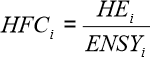
In that formula, HFC (“Heath Financing Contribution”) equals HE (“per capita expenditure on health of household”) divided by ENSY (“per capita effective income minus subsistence expenditure of household”) (pg.12):
HE or “per capita expenditure on health of household” “includes all financial contributions to the health system attributable to the household through taxes, social security contributions, private insurance, and direct, out-of-pocket payments. These include financial outlays that the household itself is not necessarily aware of paying, such as the share of sales or value-added taxes that governments then devote to health. For taxes that are not earmarked and for social security contributions, total household payments must be multiplied by the share of these revenues that ultimately goes to finance the health system” (pg.13).
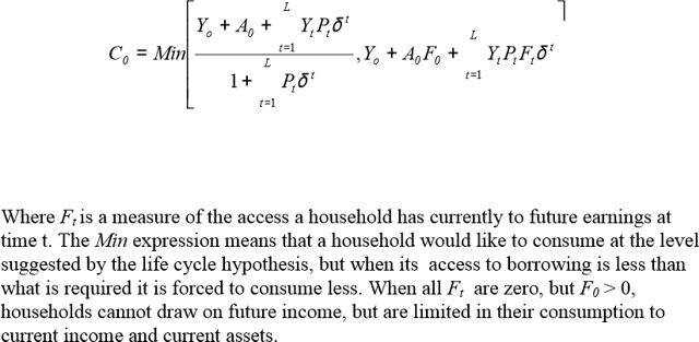
ENSY or “per capita effective income minus subsistence expenditure of household” has a very complicated formula. They explain:
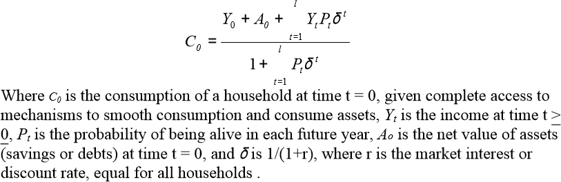
To operationalize the denominator of HFC, we need to define effective income and subsistence expenditure. Our notion of effective income is meant to reflect household tendencies to smooth consumption over time, taking account of expected variations in income over the course of the year, their assets (allowing for saving or non-saving) and their future earnings potential.
…For example, in the life cycle income hypothesis, households are assumed to smooth their consumption over the life cycle, such that expected consumption is equal in all subsequent time periods. One formulisation of this theory of consumption behaviour that is adapted to the circumstances of health is:
Hope you understood that, because they build on it on pg.14:
For households to succeed in smoothing consumption over long periods of time, effective formal or informal mechanisms must exist to allow borrowing on the basis of the present value of their future earnings or saving earnings in a form of assets that can be subsequently sold as needed. If households possess assets, in most settings these can be sold and converted into effective income although temporary problems may exist that impede the sale of assets and create liquidity problems for households. A more important problem is that in many countries mechanisms may not be available to allow households to increase consumption by borrowing on the basis of future
earnings.
Because of the imperfections of formal and informal mechanisms to smooth consumption, the income that a household is able to consume and would seek to consume accordingly given its current income, assets and access to future earnings could differ from that predicted by the life cycle hypothesis. Where no mechanisms exist to borrow or save, effective income equals income at that time; where imperfect mechanisms exist, consumption would be somewhere between current income and [the above formula]. One of the many ways to model the effects of the limited access of mechanisms to borrow is:
Ta da! That’s the WHO formula to predict what minimum consumption, “subsistence expenditure of household,” is for any given time t.
This has major problems however. First, an accurate model of necessary spending cannot be calculated based upon consistent spending. I may consistently (monthly even) subscribe to Netflix, cable TV, and a phone data plan, but no one should try to argue those are “subsistence expenditures.” Subsistence means, according to Dictionary.com, the “means of supporting life” or “the source from which food and other items necessary to exist are obtained.” My Netflix subscription does not sustain me. Second, human behavior is sometimes irrational and most of the time unpredictable. One formula cannot calculate off of household income and savings how much money a family will spend. Third, why did they choose households rather than individuals as the atomic unit? Presumably average subsistence costs to keep one person alive could have been much easier to calculate than per household costs when household size and definition varies across countries.
That all being said, if we step back from the confusing formulas, the bigger picture of what they are saying is that financial contribution is most fair if everyone pays the same percentage of their disposable income. In other words, if the average healthcare expenditure is 17% of GDP, Bill Gates should have to pay $630 million for his healthcare to make it fair. The absurdity of this claim is obviously apparent.
The United States ranked 54th with a score of 0.954 and Colombia ranked 1st with a score of 0.992.
Red Flag Summary
This factor of financial fairness has nothing to do with quality of healthcare, what WHO is presumably trying to study.
They acknowledge that not everyone or every health system will agree with their definition of financial fairness, even though they proceed to use that definition to judge every health system of every country of the entire world.
An accurate model of necessary spending cannot be calculated based upon consistent spending, although they try. One formula cannot calculate off of household income and savings how much money a family will spend; humans are unpredictable. Presumably average subsistence costs to keep one person alive could have been much easier to calculate than per household costs when household size and definition varies across countries, and yet they used households as the atomic unit for no apparent reason.
The formula used to calculate financial fairness has arbitrary coefficients.
They claim that financial contribution is most fair if everyone pays the same percentage of their disposable income but that claim is easily shown to be absurd.
Calculating Responsiveness Level
The final two factors, responsiveness distribution and responsiveness level, are weighted the least. While the first three factors — health inequality, health level, and fairness of financial contribution – were each weighted 25%, these final two factors are only 12.5% each, ultimately making less contribution to the overall score.
As they say in their methods, “Patient satisfaction, a close but different concept from responsiveness, is generally measured through household or exit surveys. Responsiveness since it deals with the interactions of the individual with the health system should ideally be examined from the perspective of the individual. The question then arises as to what the rationale was for using a key informant survey to collect data on responsiveness” (pg.5).
In other words, normally they would give exit surveys to people leaving healthcare providers asking them questions about responsiveness. However, for this survey, they chose to use key informants, individuals who are considered experts in the field. In other words, they did not choose real people who are actually getting healthcare; they chose people who are opinionated about healthcare. We would call them “self-proclaimed experts.”
The survey continues to try to justify this decision, writing:
These key informants, who were chosen for their thorough knowledge of their own health systems, were likely to be already aware of the attainment of their health systems on the elements of responsiveness, and thus better placed to evaluate the system as a whole than individuals. …Given the need to collect data within a short time period, household surveys could not have been used at this stage.
Such an important decision as whether to survey a representative population or self-proclaimed experts is one that should have been made based on justification other than a time crunch. When doing a massive study of the healthcare performance of each country’s health systems, take your time and do it right. Using key informants means they may as well have asked their own employees for their opinion again. Because they asked key informants, instead of getting a representative portion of the patient population, they got a handful of people’s opinions on the matter rather than a description of “responsiveness of the system to the legitimate expectations of the population,” like the factor suggested they should gather.
That being said, the framework for responsiveness was designed in “A Framework for Measuring Responsiveness.” The section heading for creating this responsiveness measure is literally titled in the paper, “Determining the Relevant Non-Medical Elements of the Health System,” admitting even in the paper that it assesses none of the medical qualities of a country’s healthcare.
They then define seven elements of responsiveness which they gave to the key informants to rank: dignity, autonomy, and confidentiality (collectively “respect for persons”) as well as prompt attention, quality of basic amenities, access to social support networks, and choice of care provider (collectively “client orientation”). Those seven are weighted 16.67%, 16.67%, 16.67%, 20%, 15%, 10%, and 5% respectively. The weights were decided by WHO staff and fans in the preferences survey, discussed at length later.
The country scores are supposedly calculated in a study called “Estimating Responsiveness Level and Distribution for 191 Countries: Methods and Results,” but only the final concluding table is reported. The process is not revealed. The sub-scores for each of the seven categories aren’t even provided. The only information we have about these sub-scores is that “the elements were scored from 0 to 10” (pg.4). Because they do not share their underlying data, there is no way to check or replicate their findings.Because the rankings are simply the opinions of key informants, performing the study again with different key informants would likely produce different results.
The key informants ranked the United States 1st in responsiveness level with a score of 8.10. 2nd went to Switzerland with a score of 7.44.
Red Flag Summary
Because they asked key informants, instead of getting a representative portion of the patient population, they got a handful of people’s opinions on the matter rather than a description of “responsiveness of the system to the legitimate expectations of the population,” like the factor suggested they should gather.
The section heading for creating this responsiveness measure is literally titled in the paper, “Determining the Relevant Non-Medical Elements of the Health System,” admitting even in the paper that it assesses none of the medical qualities of a country’s healthcare.
Because they do not share their underlying data, there is no way to check or replicate their findings. Because the rankings are simply the opinions of key informants, performing the study again with different key informants would likely produce different results.
Calculating Responsiveness Distribution
Responsiveness distribution, conceptually the equality of treatment or lack of discrimination across the population, was gathered with literally one question (pg.17):
Are there any specific social groups in your country who face worse health system performance with regard to any of the aspects of the health system listed above? Note that social group refers to any group within society, that differs from other groups due to demographic, economic or social characteristics, such as age, gender, education level, race, religion, income level, lifestyle, beliefs etc.
Using only this question with a small number of key informants leaves the margin of error huge and the repeatability nearly impossible.
Then, according to the Explanatory Notes, “The number of times a particular group was identified as disadvantaged was used to calculate a key informant intensity score. …The key informant intensity scores for these four groups were multiplied by the actual percentage of the population within these vulnerable groups in a country to calculate a simple measure of responsiveness inequality ranging from 0 to 1” (pg.4).
Meaning, a country which has such extreme discrimination against a social group which is a very small portion of their population that they kill those people on sight will get a better score than a country who is emotionally cold towards a social group which is a larger portion of people. Conceptually, this does not seem to be the right measurement since countries we would think discriminate heavily could score very high.
Ultimately though, the measure proved very imprecise. For responsiveness distribution, the United States tied with 35 other countries for 3rd with a score of 0.995. Meanwhile, the United Arab Emirates (A culturally homogenous country according to CIA Factbook: 42% Arab, South Asian 50%) ranked 1st with a perfect score of 1.00, meaning no discrimination.
Red Flag Summary
Responsiveness distribution was gathered with literally one question. Using only one question with a small number of key informants leaves the margin of error huge and the repeatability nearly impossible.
Because the frequency that a social group is cited as having “worse health system performance” is multiplied by the percentage of the population who is that type of group, countries that actually discriminate very heavily could score very high if the people they are hurting are a small percentage of their population.
Ultimately though, the measure proved very imprecise and not very discriminating with 35 countries tying for third place.
STAGE THREE
Determining the Weights
The “Explanatory Notes” that come with the report are supposed to tell how the researchers calculated each of the country scores at every level of the study. The PDF has a section for each of the tables and cites many of the sub-studies used to gather the data. These notes say of the calculations for “Overall Performance,” “More detail is provided in the corresponding technical paper.” The technical paper, although not provided on the same site, is “Overall Health System Achievement for 191 Countries.”
In the technical paper, they explain that this composite variable of “Overall Performance” is an aggregate of health inequality (also called health distribution), health level, fairness of financial contribution, responsiveness distribution, and responsiveness level, each variable weighted differently.
They say, “The choice of the [weighting] for each component could have been based on some arbitrary choice” (pg.3). This should raise a red flag.
In statistics, weighting determines the importance of each of your underlying factors. The larger the weight, the more of a mathematical emphasis is given to that factor and the more that factor, and not another, will determine the final result of your formula. If weights were based on an arbitrary choice, then the result of the formula is just as arbitrary.
For example, let’s imagine that a group of researchers is doing a study on a person’s level of beauty based upon the measurements of their body parts. They were going to measure everything from the circumference of their abdomen to width of their toenails. In their report, the researchers stated, “The choice of the weighting for each component was arbitrary.” So arbitrary that the width of the toenails was weighted the strongest and arbitrarily deemed the most important factor. Suddenly, you would be right to claim that they weren’t measuring human beauty but rather were measuring primarily toenail width. There results in the end would be confused and their conclusions nonsensical.
This foundational assumption, that the weights could be arbitrary, clearly undermines how they proceeded.
The WHO researchers decided to base their weights on a “survey of preferences of informed individuals for these five components” (pg.3). This is our second red flag.
In statistics, determining the weighting of factors is a rigorous process which, even though I took “Research Methods and Data Analysis” for two semesters at the University of Virginia I do not claim to understand the process thoroughly. There are multiple statistical processes, one for almost every type of data, for calculating the relative weights as well as calculating the statistical significance of those weights. This WHO study skipped all of that and instead trusted the opinions of the “informed individuals” assessed in a survey.
That survey report, again not distributed alongside the WHO Statistical Report, is called “Measuring Preferences on Health System Performance Assessment.” In the words of this study’s report, the goal of this study was to determine “the measured preferences of health systems experts and other individuals with an interest in health system performance” for each of their already decided upon five underlying factors of overall health system performance.
They write again, “In assessing the performance of health systems several normative choices have to be made. There are no right or wrong answers with respect to normative issues. To design the indicators of the attainment of the goals of the health system and a measure of composite goal attainment, parameters could have been arbitrarily selected or based on some empirical ascertainment of informed individual preferences.” This is both a reprise of our first red flag (see above for response to that) and a third red flag.
Normative means, according to Dictionary.com, “of or pertaining to a norm, especially an assumed norm regarded as the standard of correctness in behavior, speech, writing, etc.” In scientific papers, the opposite of normative is descriptive. A descriptive study is one that claims to have described the way things are. For example, a poll of our readership determining which articles you liked the best is descriptive: “Our readers do like this article.” Such a study is notably not normative. It is not trying to say, “You should like this article.”
On the other hand, a normative study or result is one that I am claiming others should believe as well. Normative is trying to answer “How should…?” rather than “How do…?” Some medical studies claim to be normative. For example, a long-term study on the effect of exercise on overall health might claim to have normative conclusions: “You should exercise.”
To claim that “several normative choices have to be made” in order to assess the “performance of health systems” is both true and false. It is false because in order to accomplish their stated goal, performing “the first ever analysis of the world’s health systems,” the study could have been purely descriptive. If it were such a study, they would have reported the descriptive results of factors they believe to be interesting and released all of the data, even ranking the countries in terms of those factors.
However, it is true that the second they desire to combine those factors together into some sort of composite variable, they are claiming to know what healthcare should be like. They have moved into the realm of normative.
In the scientific world, to make the move into normative has to be amazingly thought out. There is no arbitrary about it. A good example of this cautious movement into normative study is the standard test of intelligence, the Wechsler Adult Intelligence Scale (WAIS). The WAIS had to prove that its measurement tool was reliably producing consistent results under consistent conditions and that it’s results validly reflect the actual real world concept. To prove the first, they have to test and re-test the same set of people to prove that people score the same across time and people believed to be of similar intelligences score similarly. To prove the second, they had to demonstrate that the resulting intelligence score correlates to the things that we believe intelligence should, like specific skills and capabilities or even just social perceived intelligence.
Proving that the WAIS’s composite variable of now four primary underlying factors is both reliable and valid, the test can be normative, judging humans on the basis of their intelligence. Making a normative judgment on what humans should be to be intelligent.
There are no supporting studies which prove the reliability or validity of the WHO’s composite variable. And yet, in spite of that, they create a normative study.
They imply though that their weights are better than arbitrary because they polled “informed individuals” using their Internet-based questionnaire and based their weights off of those people’s opinions.
However, WHO means something different when they say “informed individuals” than most studies. Most studies mean that prior to taking their survey, the participants were informed about the content on the survey, either by a brief lecture, white paper, or document. Often times, the participants will be quizzed on the material they learned, to prove a deep understanding, and then they are considered “informed.”
Furthermore, if they were truly trying to create a relative weighting based upon preferences, you would expect them to choose participants who affirm the validity of their normative claims. In the case of healthcare quality, that would likely be the patients of the healthcare systems, representatives of the general public.
However, unlike most scientific studies, for this WHO survey, “Staff members of the World Health Organization at headquarters and all regional and country offices were encouraged to participate in the survey. The availability of the questionnaire was announced to WHO staff members in an email sent by the Director-General. A reminder email was sent a week after the first message that prompted WHO staff to participate in the survey.” To justify this otherwise shocking fact, the document states, “WHO staff members, by nature of their work, are exposed to health system issues constantly and are assumed to have preferences that are more informed than the general public.”
In addition to related party participants, “Internet respondents that visit the WHO web site, particularly the four pages that contained links to the survey, and are willing to participate in a questionnaire are also assumed to have informed preferences. Their interest in the health field is demonstrated by the fact that they visit the WHO web site” (pg.2).
This is a red flag for two reasons.
First, most studies exclude the participation of individuals who are related to someone or are someone who works for the company doing the survey for good reason. Staff members or relatives of staff members likely know too much about the study being conducted and have too much incentive to make the survey turn out well. For example, surveying a group of Gatorade employees to find out if Gatorade is better than other sports drinks will not produce helpful results, even though Gatorade employees are “more informed” in the field of sports drinks. They have too much incentive for the results to turn out in the way that Gatorade wishes.
It’s why if you’ve ever taken a survey, there’s often a pre-survey which asks an array of screening questions including ones like, “Do you know or are you related to anyone working in the field of marketing?” or “…working at Gatorade?” If you answer yes, you’ll likely be disqualified from taking the survey because you’re considered a related party.
Rather than avoiding related party participants though, they were the primary participant pool for the WHO survey. They may as well have saved the time and energy they used conducting the survey and instead say, “The researchers here at WHO felt they had more of an informed opinion than anyone else, so we choose these weights using our intuition.”
Second, WHO staff members and WHO website fans, although likely patients of some healthcare system, are not representative of the general public, like we would expect if WHO was trying to use participants of this survey to show the validity of their factors and weights.
This completely non-representative sample is justified by stating, “The respondents are not a representative sample of any population. Yet, the purpose of this survey was not to describe preferences in a population, but rather to empirically derive a set of weights reflecting normative choices” (pg. 2)
There’s that word normative again, used to mean an ideal standard. In other words, the average opinion of the WHO employees and fans of their website are thought of as being prescriptive of what opinion you should hold. This should spark another red flag. They are claiming, not only that their study is valid using related party participants, but that this set of participants are the best pool to choose from because their opinions are the ideal or the standard. Such pretentiousness should have no place in scientific study.
The resulting weighting of their five factors may as well have been arbitrary.
That survey produced the weights 25%, 24%, 22%, 16% and 13% to health inequality, health level, fairness of financial contribution, responsiveness distribution, and responsiveness level respectively. However, to “make the definition of the composite easier to understand” they changed the weights to 25%, 25%, 25%, 12.5%, and 12.5% respectively (pg.3). This change seems to be arbitrary and raises another red flag.
After going through all the effort of polling “informed” related party participants and producing a description of their preferences of the five factors to be used, the researchers, for ease of use, changed the weights. Any validity they could have claimed from performing the survey of their “informed” employees and fans was certainly lost when they arbitrarily diminished (when considering the two responsiveness factors) and amplified (when considering health level and financial fairness) the final weights.
No commentary is provided for why this change was made except to make it “easier to understand.”
Staff Weight
Survey Weight
Health Inequality
25%
25%
Health Level
24%
25%
Financial Fairness
22%
25%
Responsiveness Distribution
16%
12.5%
Responsiveness Level
13%
12.5%
Red Flag Summary
Statistical weights cannot be arbitrary if you’d like your results to be relevant. WHO skipped all statistical methods of rigorously calculating relative weight.
Weights are based upon opinion, rather than rigorous statistical calculation.
WHO claims to be doing a “normative” rather than “descriptive” study, but doesn’t prove the reliability of their study or validity of that claim.
Related party participants, which WHO used, are believed to skew survey results.
WHO pretentiously claims that their opinions are “normative” or prescriptive of what you should believe.
After deriving the weights through survey of their fans and employees, they arbitrarily diminish the weight some and amplify others.
STAGE FOUR
Making the Composite Variable
These five scores were then reorganized to be a value out of 100, weighted, sorted, and the overall ranking reported in Annex Table 9. In this list, the United States ranks 15th with an overall score of 91.1. Japan ranks 1st with an overall score of 93.4.
Let’s just follow those two countries to show how it was calculated. The formulas can be found in the corresponding technical paper.
Country
Health Level (H)
((H–20)/(80-20))×100
25%
Health Inequality (HI)
(1-HI)×100 or HE×100
25%
Responsiveness Level (R)
(R÷10)×100
12.5%
Responsiveness Inequality (RI)
(1-RI)×100 or RE×100
12.5%
However, one look at Annex Table 9 reveals that I have just calculated different final scores. You could try to argue it is a rounding issue — on either my part or theirs — but no mater whose fault it is, the results are significantly different especially for some countries. On these countries, it is easy to think it’s a rounding issue but the difference between my calculated rank and theirs for other countries is huge. For example:
Country
Calculated
Reported
Difference
Calculated Rank
Reported Rank
Rank Difference
Antigua and Barbuda
83.24
77.90
5.34
50
80
21
Saint Kitts and Nevis
79.71
74.80
4.91
84
98
14
Albania
72.19
76.70
4.51
122
86
36
Mauritius
81.00
76.20
4.80
66
90
24
Australia
91.86
91.30
0.56
6
12
6
United States of America
91.42
91.10
0.32
11
15
4
Dominican Republic
78.15
78.10
0.05
94
66
28
If it really is a rounding error, some countries, like Albania and Mauritius, clearly were affected more than others. Furthermore, if it is just a rounding error, the data was either not reported to the public with enough significant figures or not ultimately calculated using sufficient significant figures.
Using their calculations and my calculations here are top twenty:
Rank
Calculated
Reported
1
Japan
Japan
2
Switzerland
Switzerland
3
Norway
Norway
4
Sweden
Sweden
5
Luxembourg
Luxembourg
6
Australia
France
7
France
Canada
8
Canada
Netherlands
9
Netherlands
United Kingdom
10
United Kingdom
Austria
11
United States of America
Italy
12
Austria
Australia
13
Belgium
Belgium
14
Germany
Germany
15
Italy
United States of America
16
Monaco
Iceland
17
Iceland
Andorra
18
Spain
Monaco
19
Andorra
Spain
20
Denmark
Denmark
Repeatability is one of the primary goals of scientific study. In statistics research is an important requirement that, given your numbers, a third party can produce the same outcome. If they can’t, your method description is found lacking, you made an error in your calculations, or your entire study is thrown out because of a bad procedure.
I’m not sure which it is, but using their numbers and formulas, I didn’t get the same results.
Red Flag Summary
My calculations could not replicate their results. If it is because of a rounding error, the data was either not reported to the public with enough significant figures or not ultimately calculated using sufficient significant figures. If it is because of anything else, their study has significant problems.
Their research was not repeatable.
STAGE FIVE
Relating To Expenditure
So in Annex Table 9 Japan is ranked 1st and the United States is ranked 15th. In order to finish their study and calculate the final results of Japan being ranked 10th and the United States being ranked 37th, there is one final step.
According to the Explanatory Notes, that step is to calculate “overall performance of health systems… using a similar process [as calculating efficiency of achieving DALE] relating overall health system achievement to health system expenditure” (pg.7). The DALE efficiency calculation is described as follows:
The index of performance on the level of health reports how efficiently health systems translate expenditure into health as measured by disability-adjusted life expectancy (DALE). Performance on the level of health is defined as the ratio between achieved levels of health and the levels of health that could be achieved by the most efficient health system. More specifically, the numerator of the ratio is the difference between observed DALE in a country and the DALE that would be observed in the absence of a functioning modern health system given the other non-health system determinants that influence health, which are represented by education. The denominator of the ratio is the difference between the maximum possible DALE that could have been achieved for the observed levels of health expenditure per capita in each country and the DALE in the absence of a functioning health system.
In other words, some how they estimated DALE values “in the absence of a functioning modern health system” and “the maximum possible DALE that could have been achieved for the observed levels of health expenditure per capita in each country.” The “overall performance of health systems” being calculated in the same way suggests that they too calculated overall performance of health systems “in the absence of a functioning modern health system” as well as “the maximum possible” overall performance of health systems “that could have been achieved for the observed levels of health expenditure per capita in each country.”
If they do such calculations, I do not know how they do them. First, their work and methods are not made any clearer than that. No where do they have an addendum report to explain the formulas used to calculate this final step. The statistics machine is left a black box and, as a result, the reasoning for why Japan isn’t ranked first is lost in the process.
Second, such calculations seem impossible. It seems impossible to calculate values “in the absence of a functioning modern health system” as well as “the maximum possible” value “that could have been achieved for the observed levels of health expenditure per capita in each country.” And yet, that apparently is how they translate Annex Table 9 into Annex Table 10.
After “relating” those two values, the United States was ranked 37th with an overall performance score of 0.838. France was ranked 1st with an overall score of 0.994. Japan (ranked 1st in overall health system achievement) dropped to 10th with a score of 0.957.
Much in the news was made by taking the United State’s 37th ranking and then concluding, “We pay more than any other country for healthcare and then we only get the 37th best healthcare in the world.” But the measure for “best” healthcare already included a 25% component called “fairness of financial contribution” as well as relating our “overall health system achievement to health system expenditure.” In other words, our financial costs and efficiency level have already been doubly counted.
To report the finding in this manner is like saying, “The engagement rings at Tiffany are very expensive and not everyone can afford them. We will rank Tiffany 37th and Cracker Jack rings first because everyone has an equal chance of finding one in a box.” And after the financial component pulls Tiffany down to 37th saying, “At Tiffany you pay more than you do elsewhere and you only get the 37th best engagement rings.”
Red Flag Summary
It seems impossible to calculate values “in the absence of a functioning modern health system” as well as “the maximum possible” value “that could have been achieved for the observed levels of health expenditure per capita in each country.” And yet, that apparently is how they translate Annex Table 9 into Annex Table 10.
Their work and methods do not make this process clear. Their study is not repeatable.
Conclusion
It is for all these reasons that I conclude that their study is not valid, reliable, or repeatable. It should be ignored.
 Red Flag Summary